| Introduction | Exploratory Analysis | Forecasting Orders | Classifying Orders |
Data Exploration
This section investigates the relationships between features and the individual characteristics of some selected variables. The main goal is to understand the data and also the underlying processes driving data generation.
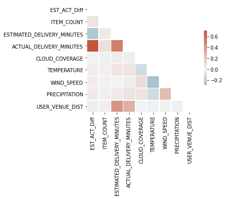
Correlations
The matrix of correlations between variables indicates that most variables have low correlations, meaning no structural causality can be generated variables in their current form.
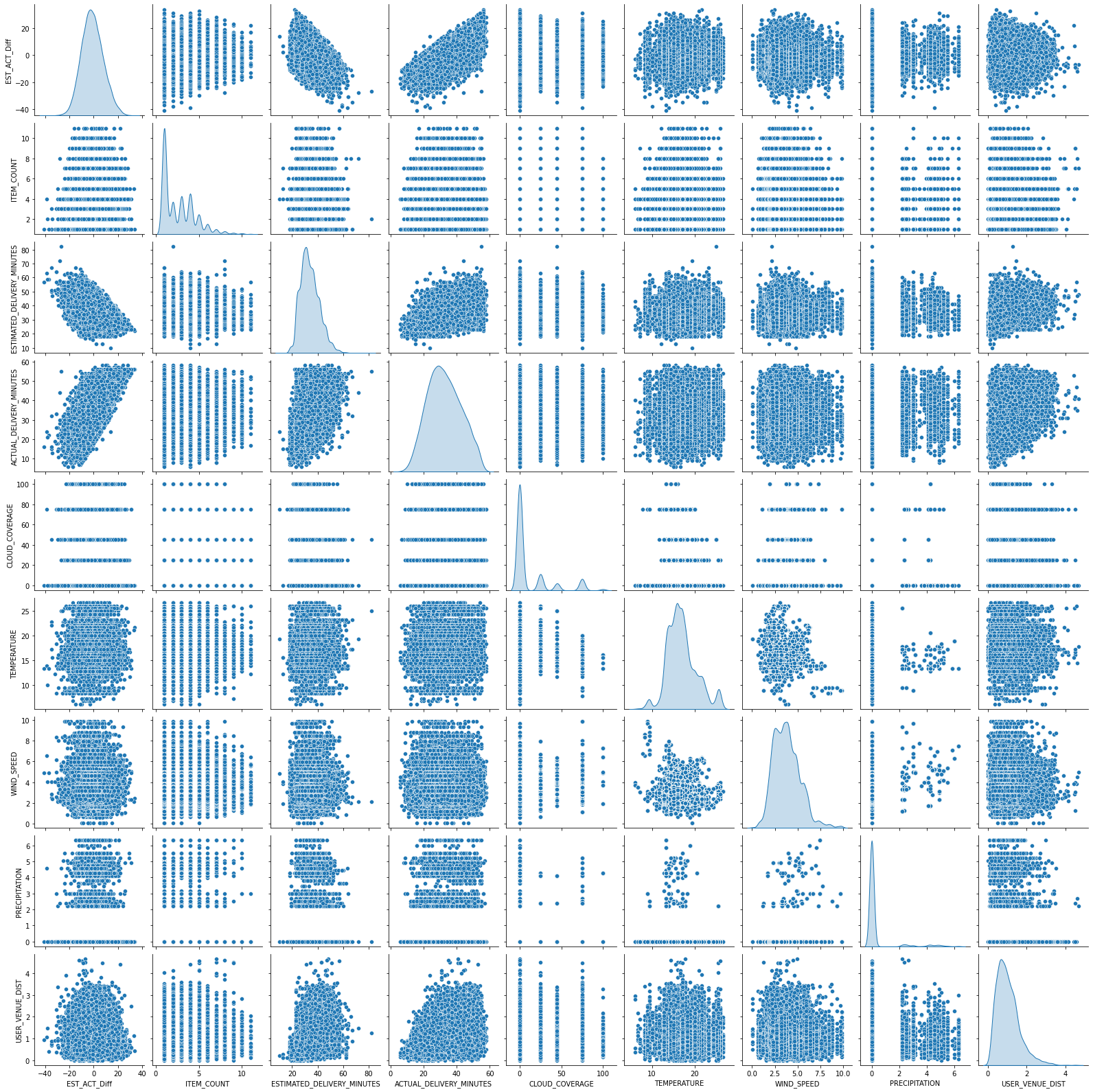
The image below shows the scatter plots of individual variables against each other. As the scatter plots show, most variables do not have a strong linear relationship among each other. Additionally, the KDE plots show characterisitcs of the variables, only the EST_ACT_Diff shows signs of a normal distributions while others have non-normal distributions.
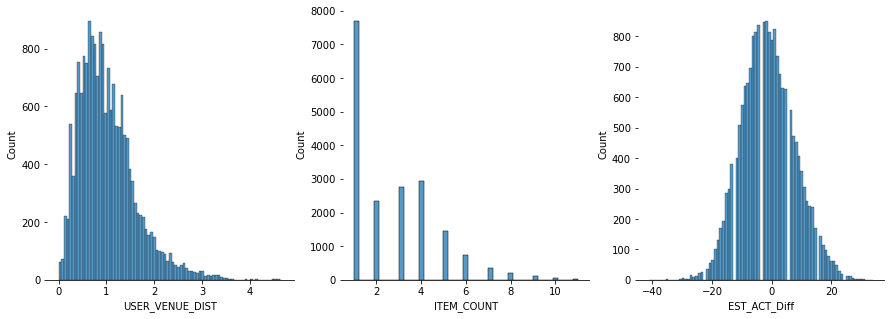
Distributions plots of Key Variables
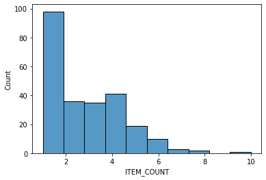
The distribution of USER_VENUE_DIST shows that the average distance between users and venue is about 1Km (1.02), the plot also shows a tendancy to have distances that are further than 2Kms. ITEM_COUNT distribution shows that orders with 1 item are dominant (average 2.6 items), interestingly, some orders may though rare may have more than 4 items. The EST_ACT_Diff variable represents the difference in minutes between estimated time for a delivery and the actual time it takes for the delivery to be completed. The distribution is interestingly almost centered around zero (-1.2) but also shows signs of under/over estimation of the time required to deliver the meals.
Day of the week effect and orders per day
Similar to what was already observed, 1 item orders are more common, this pattern is repeated also at a single day level, the graph below shows distribution of orders on a single random day.
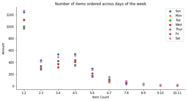
Intuitively, it is expected that some days of the week may have a larger number of orders than others. The graph below shows the disparity between orders across different days of the week.
The graph below shows that Sundays, Saturdays followed by Friday are the most popular days with respect to orders. A weekly view shows a similar pattern to a day view such that one item are most popular across all the days of the week while orders with a large number of items are few.
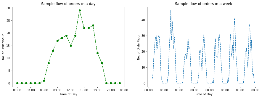
Orders per hour
We can also try to understand the flow of orders on an hourly basis, the data provided indicated orders in the minute frequency which made it possible to coalesce the orders into a hourly basis. The graphs below indicate a 1-day snapshot and a 7-day snapshot. As expected, orders peak during lunch hours every day, forming a very cyclic series.